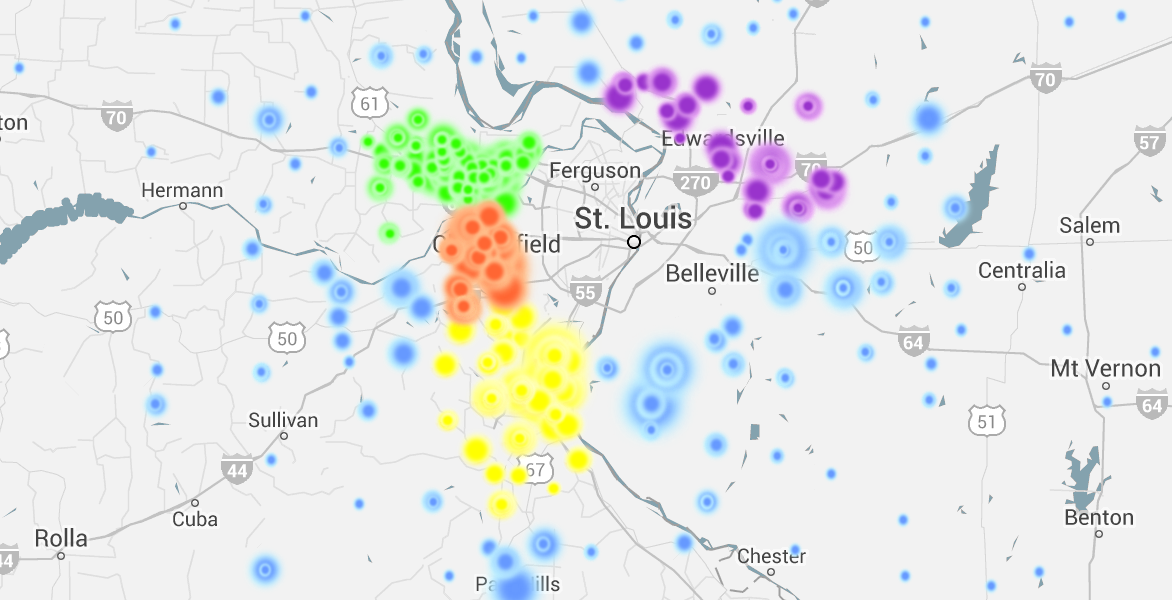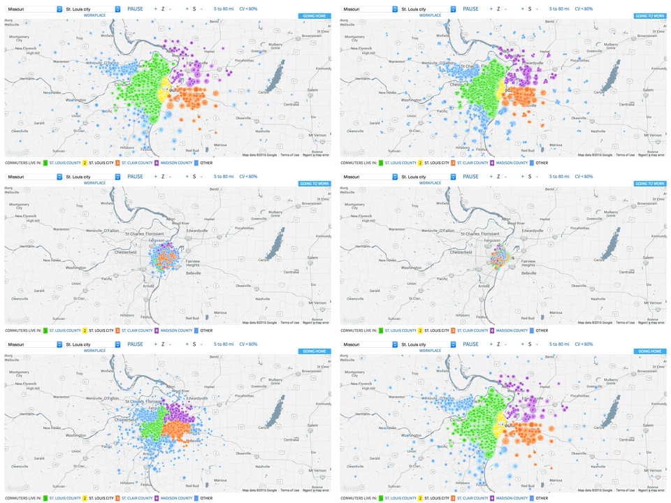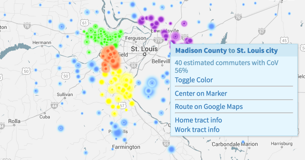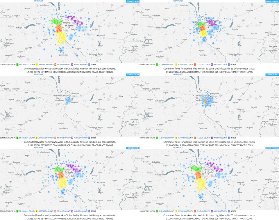
Sometimes we stumble upon something that’s just interesting. I’m not sure what’s to be learned by watching this visualizing of work commutes into St. Louis City, but it’s pretty cool. And while it’s fun to watch, there’s some real information present as well if you pause and click.
What you’re looking at above are commutes to St. Louis City of more than 20mi. This excludes St. Louis County from just outside I-270 to the city limits. The GIF below shows commutes into St. Louis City from 5-80mi. This includes commutes within the city of that distance (in yellow).
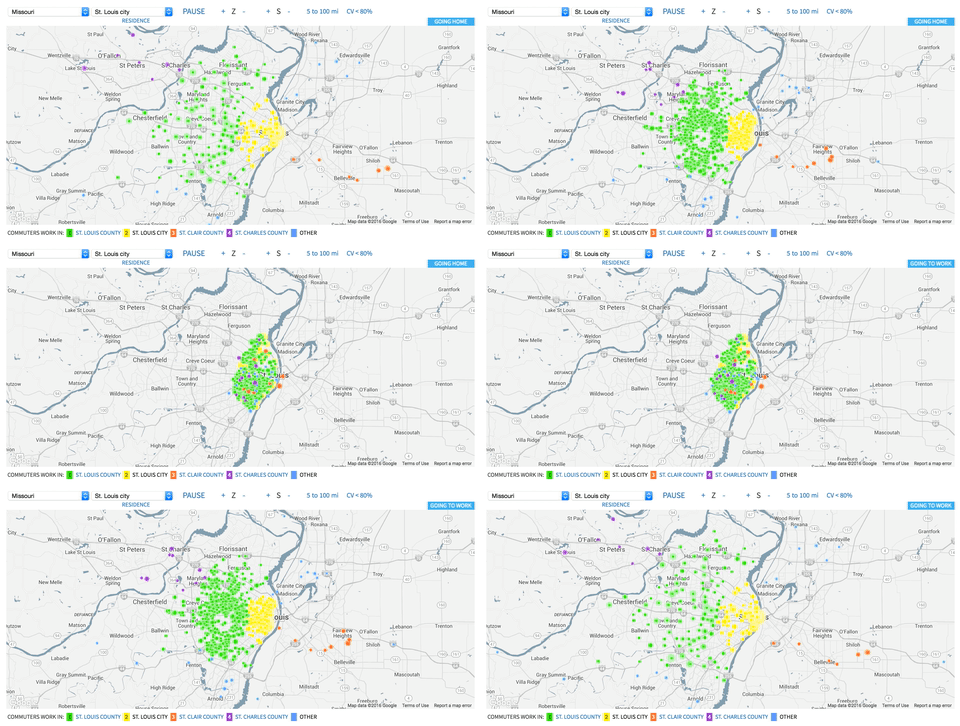
The GIF below is set to show commutes of 5-100mi from St. Louis City. This then includes commutes within St. Louis City as well.
The really cool thing is that the visualization can be seen for any county in the U.S. Mark Evans used data from the American Community Survey and Google Maps to show commutes from each U.S. Census tract. St. Louis City is below, but you can check any county by visiting the Commute Map on Mark’s I Love Big Bytes blog. There’s more information at an accompanying blog post.
