You might look at the overall population numbers for the city of St. Louis the last several decades and see a consistent albeit slowing decline. However, the top line number represents only a high level view of the 66 sq. miles of St. Louis and its residents. An examination of the neighborhood level population numbers and demographics, reveal much more about the changing populations within the city’s boundaries. While the neighborhood boundaries are arbitrary, they often (at least attempt) to represent distinct community districts (or parts of them). St. Louis City has been publishing demographic and population breakdowns for their 79 neighborhoods since 1990. This data is not a big data set, but contains (in my opinion) a lot of interesting facets and can be difficult to visualize and understand at a granular level. Through this article, I will hopefully illuminate some of the interesting trends to help the reader have a fuller understanding of the dynamic changes of St. Louis City’s population over the last 30 years.
The Data Set
Before we get to the interesting stuff, let me give you a little more info about the data through which we are looking. On the St. Louis government website, neighborhood census data is available for 1990, 2000, 2010, 2020. If you want to look at the individual neighborhood data you can check out the light web app I built: Neighborhood Census Tool. All the decades show total population numbers, but the 1990 dataset has more limited racial population numbers. It only breaks down races as White, Black, or Other. Beginning in 2000 the data set includes White, Black, Asian, American Indian + Alaska Native, Native Hawaiian + Other Pacific Islander, Two or More races, and Other as possible races. Note that Hispanic ethnicity is also counted in the data, but those numbers are tracked separate from race. So a resident may mark their census form as White Hispanic, Black Hispanic, etc. Therefore the race demographic discussions below will not cover Hispanic ethnicity.
The neighborhood boundaries are arbitrarily set, so some neighborhoods are much larger than others and the total population varies from 0 (in the case of Kosciusko in 1990) to nearly 18k (Dutchtown in 1990). If you dig through the data posted, you might also see some name variations as neighborhood names (or their spellings) have been adjusted over time (see McRee Town->Botanical Heights). Some of these changes are intentional while others may be because several possible spelling may be commonly used. When I most recently checked, there has been some effort to update the older data available on the government site with the most recent version of the neighborhood name. I think there could probably be many posts about all the neighborhood names such as digging into why two adjacent areas in southern St. Louis are “North Hampton” and “Southampton” both of which are actually East of Hampton Ave. not North or South. But I digress; we are here for the numbers not the etymology, so let’s get back to it.
St. Louis Overview
First, let’s walk through the numbers for the entire city population combined. These are data points you will most often see cited when St. Louis’ population changes are discussed and will give us a starting viewpoint for when we dig into neighborhood level data. Over the last several years, there has been much discussion about if the total population stays above or drops below the 300k mark. While 299k and 301k are pretty close overall, we tend to gravitate towards nice round numbers as a society, so that 300k threshold has some significance. In 2020, the city managed to stay above that threshold with a total of 301,452 residents by the Census’ count. That total represents a 24.0% decline in residents since 1990 when the city had almost 400k residents. Since 1990, both the Black and White populations have declined by slightly higher percentages (31.1% and 34.6%, respectively) compared to the overall population, while “Other races” population has grown dramatically (538%!), albeit from a much lower raw starting point. While both Black and White population changes over 30 years look similar, the decline of the white population has slowed dramatically in the last 20 years, while the decline of the Black population has actually accelerated (see charts below).
These varying levels of demographic population decline have led to the percentage of the total population shifting from 51% Black in 2000 down to 41% in 2020. During the same time period, the percentage for White residents has remained almost the same (43.8% in 2000 and 43.9% in 2020). The other populations have grown to fill the remaining percentage points. In 1990 Other races made up only 1.6% of total population, but that grew to 13.1% in 2020. As noted above, starting in 2000, the Other population was broken down into more granular groups. The fastest growth out of those more detailed groups in the last 20 years was in the Multi (Two or More races) category (+11,810 residents/+181%), followed closely by Asian (+5,398/+78%) and Other (+4,970/+179%) (this “Other” now only encompasses residents which don’t fall into any of the more detailed demographics).
Neighborhood Overview
While overall city population decline has continued though decelerating, digging into the neighborhood level data allows for a better understanding for which areas of the city are driving decline and which areas are bucking the trend. I have classified each decade (’90-’00, ’00-’10, ’10-’20) for every neighborhood based on its total population percent change. I classified a neighborhood as Steady if it had less than a 2% change in either direction, Increasing if population went up by more than 2% and Decreasing if population dropped by more than 2%. Between 1990 and 2000, a whopping 62 (out of 79) neighborhoods decreased population. Over the last decade (’10-’20), the majority of neighborhoods still saw declines, but 21 neighborhoods managed to increase population (see table below).
Neighborhoods by Population Change
| Pop Change | 1990-2000 | 2000-2010 | 2010-2020 |
|---|---|---|---|
| Increased | 13 | 15 | 21 |
| Steady | 4 | 5 | 9 |
| Decreased | 62 | 59 | 49 |
These numbers show that more than a third of city neighborhoods did not follow the general narrative of St. Louis’ population decline. Before digging into which specific neighborhoods are bucking the overall trend of population decline (and which ones are driving that trend), I wanted to look into the data around another common narrative of St. Louis, that the city is highly segregated.
Neighborhood Diversity
When we looked earlier at overall population numbers, St. Louis has shown a very evenly racially balanced overall population over the past thirty years with no one racial group making up more than about half of the population. But when we start looking at the individual neighborhood data, you can easily see very highly segregated neighborhoods. For a simple look at how many neighborhoods were highly segregated, I categorized each neighborhood as segregated if a single racial group made up more than 90% of that neighborhood’s population. Even with what I thought would be a pretty high bar to hit for being classified as segregated, in 1990, the majority of St. Louis neighborhoods were segregated with 24 neighborhoods over 90% Black and 21 neighborhoods over 90% White. The White segregated neighborhoods in 1990 were entirely in the southern half of the city (only Hi-Pointe had any territory north of Highway 40), and the Black segregated neighborhoods were all in the northern half of the city. But by 2020, only 18 neighborhoods total remained segregated by this measure. Only a single neighborhood, the Hill, remained over 90% White, while 17 neighborhoods stayed over 90% Black.
Highly Segregated Neighborhood Count (over 90% of single race)
| Segregated by | 1990 | 2020 |
|---|---|---|
| Black | 24 | 17 |
| White | 21 | 1 |
| None | 34 | 61 |
So while the city-wide racial population breakdown looks very similar in 1990 (51.0% white/46.5% black) and 2020 (43.9% white/43.1% black), at a neighborhood level, populations have seen much more change and have become significantly more diverse. And even in the remaining segregated neighborhoods, diversity has increased, just not to the point where no race hits 90%. For example, the Jeff Vanderlou neighborhood was 98.9% Black in 1990, but in 2020 was <i>only</i> 92.3% Black. Of course, there are some neighborhoods that barely missed the 90% cut-off too. By the simple measure used here, Fountain Park at 89.2% Black in 2020 is not considered highly segregated (it was 99.1% Black in 1990).
For a better look at how diversity has shifted across neighborhoods, I calculated a Diversity Index for each neighborhood every decade. The Diversity Index is one used by the Census Bureau based on Simpson’s Index of Diversity and measures the probability that two residents chosen at random will be from different racial groups. An index of 0% means all residents are the same race and 100% would mean every single resident was from a different race. In 2020, the Diversity Index for the entire United States was 61.1%. The visual below shows the Diversity Index for every neighborhood in each decade. The darker colors indicate more diverse neighborhoods. As you flip between the decades, the map trends darker (more diverse) each decade. Hover over a neighborhood to see its Diversity Index for a given year.
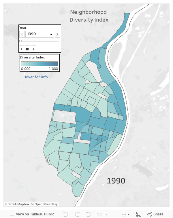
When looking over the 30 year period only 8 neighborhoods became less diverse. Looking at the cause of decreased diversity, only one (Lafayette Square) decrease appears to be driven by a decrease in Black population. The other seven neighborhoods decrease in diversity appears to be caused mostly by the loss of white residents, in what appears to be the tail end of the white flight from northern St. Louis during the second half of the 20th century. The best example of this white flight in these seven neighborhoods is Baden where in 1990 there were still 2,983 White residents of the neighborhood (41.7%). By 2020, only 214 of the residents were White (3.9%).
In the other 71 neighborhoods, diversity increased and often by a lot. Many southern St. Louis neighborhoods went from predominantly white to much more diverse. In 1990, Bevo Mill was 97.9% white and there was only a chance of 4.1% that two random residents were from different races. By 2020, that chance had risen to 60.2%. But it wasn’t just White segregated neighborhoods gaining diversity. The West End neighborhood (not to be confused with the CWE), was 97.8% black in 1990 and similar to Bevo Mill had a Diversity Index of just 4.4%, but by 2020 that Index had jumped to 46.7%. View the map below to see each neighborhood’s 30 year Diversity Index change.
While, ideally, increased neighborhood diversity would coincide with population growth, in reality many of the neighborhoods became more diverse not so much because of a growth of the neighborhood minorities, but more so because the majority group lost population at a fast rate. For example, the Diversity Index of Calyton-Tamm (part of the not-officially-a-neighborhood Dogtown area) rose 13.8% (12.9% in 1990 to 26.7% in 2020). In 1990, the neighborhood was home to 3,006 White residents and 150 Black residents. In 2020 Black residents had actually dropped to only 107, but White residents fell to 2,000. Coupled with the growth of other racial groups from 70 to 241, the neighborhood became more diverse.
Highly Segregated Neighborhood Count (over 90% of single race)
| Segregated by | 1990 | 2020 |
|---|---|---|
| Black | 24 | 17 |
| White | 21 | 1 |
| None | 34 | 61 |
One item to note is that the Diversity Index calculation is slightly skewed for the data set because in 1990 the only three races tracked in the census data were White, Black, and Other, and the Other group became 5 different groups in 2000. By tracking more groups, the Diversity Index would increase even if the actual populations of all groups remained the same. However, since the Other group was so small in 1990 relative to the White and Black groups, the impact will not be large.
Does Diversity impact overall Population trends?
So now that we have a better view of how diversity has shifted, I wanted to look at how overall populations correlated with the diversity of a neighborhood. Put another way, do more diverse neighborhoods see higher rates of population growth? First, I looked at a neighborhood’s Diversity Index in 1990. The chart below shows the 30 year population change of every neighborhood compared to its Diversity Index from 1990 (y-index). The red dashed line is the trend line, and while more diverse neighborhoods did tend to preform slightly better, the relationship is not very strong.
The relationship gets a little stronger when we shorten the time period from 30 years to look at only the last 10 years. When plotting neighborhoods by diversity index in 2010 compared to 2010-2020 population change, the highest raw gains are seen mostly in neighborhoods with high levels of diversity. The top 5 neighborhoods in that time period all had Diversity Indexes over 50% in 2010. On the opposite side, 8 out of the bottom 9 neighborhoods with the largest population losses had Diversity Indexes below 10% in 2010. Looking at the plots below, it is clear that being a diverse neighborhood by this measure alone won’t guarantee population growth (see Carondelet still losing almost 1,000 residents between ’10-’20 while having a 55.5% Diversity Index), but it certainly doesn’t hurt.
While the Diversity Index gave a good gauge of overall segregation, it doesn’t show which racial group has the majority population in a given neighborhood. For that I went back to my more blunt highly segregated measure (90%+ one race) and looked at how the Black segregated and White segregated neighborhoods fared over 30 years. Below shows a box plot (outliers not shown) showing the range of population changes for each type of neighborhood including non-segregated neighborhoods (note: this time we are looking at % change not raw change in population). I used the neighborhood’s classification from 1990. While the non-segregated neighborhoods have a very wide range, it is pretty clear that the White segregated neighborhoods saw much less population loss (and in some cases gains) than the Black segregated neighborhoods.
Out of the 21 White segregated neighborhoods in 1990, the median population change over the next 30 years was -14.4%, while for the 24 Black segregated neighborhoods it was -50.0%. In total, the 21 White segregated neighborhood’s population went from 137,571 in 1990 to 121,556 in 2020, an -11.6% change, while the 24 Black segregated neighborhoods went from 131,082 to 65,619 over 30 years, a -49.9% change. The remaining 34 neighborhoods showed a similar (but slightly less) population drop compared to the White segregated neighborhoods, going from 128,110 residents in 1990 to 114,277 residents in 2020, a -10.8% change. Of the nearly 100k residents that the city of St. Louis lost over the 30 years since 1990, 68.6% of that loss came from just the 24 neighborhoods that were highly segregated black in 1990.
Caption: Boxes show median, 1st, and 3rd quartile values. The whiskers are set to exclude outliers and therefore show the closest neighborhood value inside 1.5 times the 3rd to 1st quartiles spread above or below the 3rd and 1st quartiles.While the neighborhoods that were highly segregated White in 1990, saw less population loss than the Black segregated neighborhoods over the 30 year period, as we noted previously they became much more diverse. So in most cases they gained many non-White residents to offset the loss of White residents. Only a single one of the 21 neighborhoods highly segregated White in 1990 gained White residents over the 30 years (Cheltenham), but every single one of those neighborhoods gained non-White residents. When comparing the highly segregated Black and White neighborhoods, both actually lost population of their majority demographic in similar numbers. The 21 high majority White neighborhoods lost 53,561 White residents, but gained 36,233 non-White residents which greatly softened population loss. The 24 high majority Black neighborhoods lost 68,756 Black residents, but only gained 3,293 non-Black residents leading to much larger overall population decline in those neighborhoods.
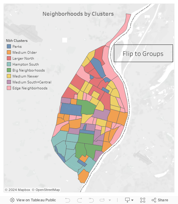
Grouping Neighborhoods
Returning to an earlier question I posed, “which specific neighborhoods are bucking the overall trend of population decline”? I decided to create some neighborhood groups that have similar population characteristics. Two different methods were used. First, I created a set of manual buckets based solely on a neighborhood’s total population change for each decade. Second, I used a clustering model which uses total population along with the percent of the population that are White and percent of population that are Black. Both methods have classified every neighborhood into one of 7 options. Below is the map showing the designations with more explanation behind the two methods further below. Use the button in the visual to toggle between the two method’s results.
For the bucketing options, I used the following seven groups:
| Group | # of Nbhs | Description |
|---|---|---|
| Continued Decrease | 38 | Consistent drops in population over 3 decades |
| Trending Down | 6 | Increases in pop in ’90-’00 have given way to declines |
| Mixed | 8 | No large trends across the 3 decades, overall mostly flat |
| Recent Reversal | 12 | Declines in pop in ’90-’10 have changed into increases since |
| Sustained Reversal | 10 | Two decades of growth after an initial decade of decline |
| Slowing Rise | 3 | Several decade of pop growth beginning to slow |
| Continued Rise | 2 | Three decades of growing population |
These groups are only accounting for overall population percent change, so the groupings don’t reflect any of the diversity measures discussed earlier. The Continued Decrease (orange) neighborhoods are spread throughout the city from way down in Carondelet to up in North Pointe. It is unfortunately the largest group, and along with the Trending Down (pink) neighborhoods, shows that overall the city still has a lot of work to do in if they want every neighborhood stable or growing. But as the map shows, there are also many areas that don’t fit the simple “St. Louis is shrinking” narrative. While the Continued Rise (red) group is small (only Midtown and DeBaliviere Place) when combined with the Sustained Reversal (purple), it makes up most of the neighborhoods along the commonly discussed “Central Corridor” along with a few surrounding neighborhoods like Soulard and the West End. In the Recent Reversal (green) group you can see some of the Central Corridor growth expanding further into neighborhoods like Vandeventer, Columbus Square, and Botanical Heights (Recent Reversal has some other farther flung neighborhoods too). Most of the Mixed (light blue) group also mostly hover on the edges of the Central Corridor. To reiterate the article’s title, these groups show a dynamic set of neighborhood population change over the last 30 years.
For the clustering, I was a little less concerned about the overall population changes, but instead wanted to see which neighborhoods would be grouped together if I considered the neighborhood’s racial demographics. For the clustering, I used a k-means cluttering method with the number of clusters set at 7 (matching the number of manual groups I created in the first method) which kept the group sizes reasonable. As inputs I used a neighborhood’s total population, Black percent of total population and White percentage of total population for 1990, 2000, 2010, and 2020 (12 inputs total). In the map above you can click the “Flip to Clusters” button to view which cluster each neighborhood fell into. Below are the clusters which I gave some descriptive names after looking at the results. These descriptors are more qualitative based on trying to label these clusters so take the names with a grain of salt.
| Cluster | # of Nbhs | Description |
|---|---|---|
| Medium Older | 14 | At least several thousand in population and historically white trending more diverse |
| Larger North | 9 | Larger historic neighborhoods with large black populations |
| Hampton South | 7 | Neighborhoods with mostly stable total populations and large white populations |
| Big Neighborhoods | 4 | Largest populations (10k+) in the city and also tend to be very diverse |
| Medium Newer | 17 | At least several thousand in population and historically black trending more diverse |
| Medium South and Central | 8 | Diverse and sizable (5k+ populations) often growing |
| Edge Neighborhoods | 20 | Smaller neighborhoods often surrounding other larger established ones |
Total neighborhood size definitely weighs heavily in these groups, but there are some interesting facets from these clusters beyond just neighborhood size. The Medium Older and Medium Newer clusters I found interesting, because the Medium Older seemed to grab more traditionally known neighborhood districts like Dogtown, Downtown, the Hill, Lafayette Square, Soulard, and Benton Park. While Medium Newer took more neighborhoods that have become trendy more recently, Forest Park Southeast (the Grove), Fox Park, Grand Center, and Vandeventer. Both groups had similar sized total populations, but the major differences seem to be that the Medium Older cluster has been more historically White trending diverse and the Medium Newer more historically Black trending more diverse. And while the Edge Neighborhood Cluster is mostly small neighborhoods, it does appear that many of them align with the larger neighborhoods next door that may impact growth (Downtown -> Columbus Sq. and Lewis Place, Midtown -> Tiffany, CWE -> Fountain Park, Dogtown -> Cheltenham).
Ethnicity
As I noted in the data set section, Ethnicity is counted by the census separately from race. Before concluding, I wanted to put in some quick notes on the Hispanic populations in St. Louis neighborhoods. Overall, the Hispanic population has grown from 7,022 in 2000 (Ethnicity was not included in 1990 neighborhood data) up to 15,395 in 2020. In 2020, that still accounts for only a rather paltry 5.1% of the total population. In the US overall, residents of Hispanic ethnicity were 18.1% of the total population in 2020 and even in nearby Kansas City the percentage was 10.1% according to the Census’ 2020 American Community Survey. The neighborhood with the largest number of Hispanic residents each decade since 2000 has been Dutchtown. In 2000, 637 Hispanic residents called Dutchtown home and that nearly tripled to 1,861 in 2020.
Even the neighborhoods with the most Hispanic residents only hit the low double digit percentages compared to total population. Excluding Kosciusko (which had a total of only 52 residents in 2020), Benton Park West had the highest percentage of Hispanic residents at 13.2%. While it is bounded on one side by Cherokee St. which St. Louis touts for Hispanic-American culture, this neighborhood still falls below the US average for Hispanic residents. St. Louis’ Hispanic population has grown across most neighborhoods each decade, but growth is slow in most cases.
St. Louis has a Dynamic Population
I’ll finish by restating my initial thought, St. Louis’ population has a lot of dynamic changes going on at the neighborhood level that are easily obscured if you only look at city-wide numbers. Across the board, neighborhoods are growing more diverse (by a lot in some cases) and there are large sections of the city that are seeing population growth even while the city as a whole has lost residents each of the last three decades. Looking over three decades, the sections of the city with growing populations are getting larger, spreading across more neighborhoods and are some of the city’s most diverse areas. Hopefully, by 2030 there are enough growing neighborhoods to offset any losses elsewhere.
