
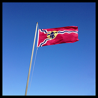
 When I was bicycling around south St. Louis a few weeks ago, I noticed the St. Louis city flag flying prominently in front of several private homes. St. Louis pride runs deep in this town, so it makes sense that many fly the flag. I share that pride, but I believe there’s another reason the flag is so popular: It looks really, really good.
Aesthetically, I think it’s one of the best flag designs in use anywhere. I actually sit around and think about ridiculous things like “who has the best flag”, so I’ll take on any challengers to this argument. Unless you live in the United Kingdom or maybe Bhutan, I think the St. Louis flag is better than yours.
Seeing it around town, I started to wonder how it came to be. When was it adopted? Who designed it? How did St. Louis get this minor aspect of their city so right? Turns out, it’s a pretty good story.
 St. Louis’s flag is exceptional for many reasons. It’s simple, it’s unique, it uses just a few basic colors, and it contains several components that symbolize the history of the city. It doesn’t have lettering (it’s difficult to read a waving flag), it doesn’t have a seal (a seal is meant to be seen up close, such as on a document), and maybe best of all, it doesn’t use the image of the Gateway Arch. The St. Louis flag does exactly what it’s supposed to do: It’s a symbol for the city and it’s easy to identify from a distance.
I’m not alone in my opinion. In my initial research for this post, I stumbled upon an organization named the North American Vexillological Association. According to Wikipedia, vexillology is the “scientific study of the history, symbolism[,] and usage of flags or, by extension, any interest in flags in general”. It also seems there are quite a few prominent vexillologists around that take flag design very seriously. In 2004, NAVA held a survey to rank the top 150 American city flags. St. Louis came in fifth, behind Washington D.C., Chicago, Denver, and Phoenix. Personally, I think St. Louis has them all beat. Maybe I need to join NAVA and set things straight.

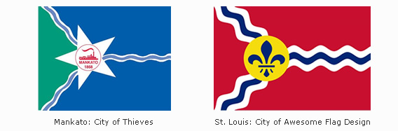
In contrast, take a look at Milwaukee’s flag below. I’d wager not many porches in our fellow beer town are waving this travesty. I thought I’d offer up my own design that I think is a far better representation of that fair city.

How about Mankato, Minnesota? The folks there must know a thing or two about good flag design. They know the St. Louis flag design is so good, they should just rip it off. Too bad they screwed it up by adding the riverboat, lettering, and a putrid color scheme.
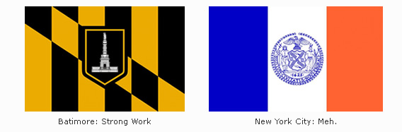
It’s actually only a recent development that American states and cities starting flying official flags. Prior to the 20th century, many believed the United States flag was the only banner needed. Despite this sentiment, Baltimore kicked things off in 1914 by adopting an official city flag, followed by New York City in 1915.
It didn’t take long for St. Louis to join the fun. In 1915, a man named Percival Chubb suggested that St. Louis should design and adopt an official municipal flag. Soon after, a group named the Pageant-Drama Association held a contest, offering $100 to the winning design. The winning design would then be offered to city authorities as an “appropriate city flag”.
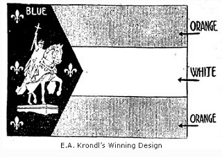 A winning design was announced in January, 1916. The winner was a young St. Louis artist named Edward A. Krondl. It featured a white figure of St. Louis on his horse in front of blue background. Surrounding St. Louis are four fleur-de-lis, representing the Louisiana Purchase and signifying the city of St. Louis as being the fourth-most populated city in the United States. The flag also contained three stripes on the right, signifying Krondl’s idea that St. Louis would soon advance to third place. The color blue behind St. Louis represented celestiatlity, the white stripe represented purity and cleanliness, and the two orange stripes represented gold, wealth, and prosperity.
His winning design kicked off quite a debate. Some argued that a flag was no place for a portrait. Percival Chubb complained that the blue was too blue and the orange wasn’t orange enough. He made Krondl change it. Almost everyone agreed that the four fleur-de-lis representing St. Louis as the fourth city was impractical. If St. Louis dropped in the rankings, the flag would need to be redesigned (today, it would need fifty-eight).
The city aldermen were the least impressed, with some even hinting favoritism. Alderman Gus Bauer was accused of promoting Krondl’s design since he represented the area where Krondl lived. In one humorous exchange during the debate, Bauer barked at one of his accusers “What do you know about art? You’re a florist!”.
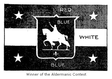 Ultimately, the city aldermen rejected the design and decided to hold a contest of their own. After reviewing over 150 designs, a new winner was announced on May 20, 1916. This time, a young man named A.P. Woehrle was awarded $100 for his winning design. The new design replaced orange with red and centered the image of St. Louis in front of a blue shield. Stars replaced the fleur-de-lis, but surprisingly, they held the same symbolism. St. Louis was to be represented as the fourth city.
It’s not difficult to notice that the two designs are very similar. And that’s where things get interesting. It was soon discovered that the same artist designed both flags. Claiming that he wanted to win on merit and not on the prestige from winning the first contest, Edward Krondl entered his new design under the name of his friend, A.P. Woehrle.
By this point, the aldermen didn’t really care. Except for one alderman who refused to vote for any flag that wasn’t the stars and stripes, they had their flag. To celebrate the new design, the aldermen all hopped on a riverboat and took a ride on the Mississippi with the new flag proudly snapping in the wind.
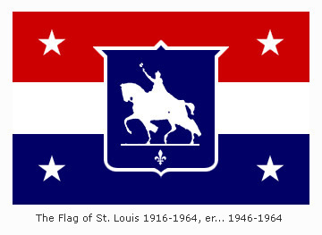 Thirty years later, it was discovered the flag argument wasn’t finished. In 1946, a local man stumbled upon a collection of varying St. Louis flag designs. Unaware of the competitions held in 1916, he walked over to City Hall to see what he could learn. He was startled to discover that St. Louis didn’t have an official flag. After their friendly boat ride promoting the new banner, the aldermen went back to work on other matters. They never bothered to make the new flag official.
An ordinance was quickly passed in 1946 to correct the oversight, but many St. Louisans were now reminded that the design wasn’t very good to begin with. Prominent St. Louisan Charles Nagel, an architect who would come to play a role in the selection of the Gateway Arch design, declared the 1916 flag to be “wretchedly bad in heraldic design”.
Proponents for a new design became more vocal in the 1950′s. Even the St. Louis Post-Dispatch promoted the idea of a new flag with an editorial in 1957. Eventually, Charles Nagel called upon an acquaintance who had experience designing flags. Theodore Sizer, an art professor at Yale, came to St. Louis and designed the flag that flies in St. Louis today.
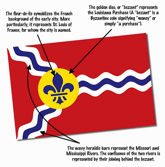
Sizer also used specific colors to represent the four empires that have ruled St. Louis:
- Spain – Red and Gold
- Bourbon France – Blue and White
- Napoleonic France – Blue, White, and Red
- The United States – Red, White, and Blue
In an article for St. Louis Magazine in October 1964, Sizer explains that designing the flag presented quite a challenge. He was asked to incorporate the history of the city into the design, with references to the Louisiana Purchase, Charles Lindbergh, and even Stan Musial. Most importantly, he was told his design must include the image of St. Louis on his horse.
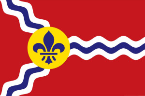
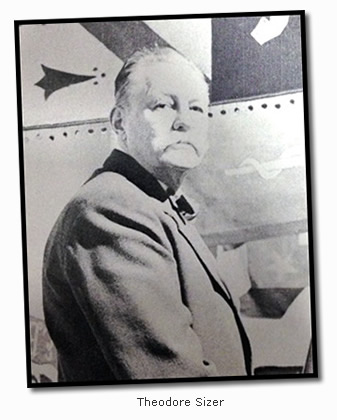 Fortunately, Sizer had better ideas in mind. In response to using the image of St. Louis, he stated: “I have nothing against St. Louis, or his white horse, but on a flag it looks like anybody on any horse. Dammit, you look at it and you can’t tell if it’s Saint Louis, King Arthur, or Robert E. Lee.” To the benefit of St. Louis, he took his design in a completely different direction. “The one distinctive feature about the city of St. Louis are the rivers, the confluence of the Missouri and the Mississippi. The confluence was the reason for St. Louis being founded by the settlers in the first place.”
Sizer stressed the importance of how the flag would look at a distance. When it was suggested an eagle be included in the design, he responded that it would have “looked like a chicken or some other bird”. Fortunately, he also rejected incorporating the newest of St. Louis symbols. “And we decided to stay clear of the new Saarinen arch. Would have looked like a chicken wishbone at thirty paces.”
Fortunately, Sizer was able to bring others around to his way of thinking. When the process was complete, Sizer’s design was officially adopted as the St. Louis municipal flag on February 3, 1964. Theodore Sizer died in 1967. Today, his design can be found flying around the city without a whisper of derision. Eat your heart out, Milwaukee.
____________________________________
This post first appeared on the excellent Distilled History blog, where Cameron Collins explores the history of St. Louis and its modern cocktails. Check out his post to find out where he found a watering hole on this trip. Cameron’s site was recently recognized by the Riverfront Times Best Personal Blog.
