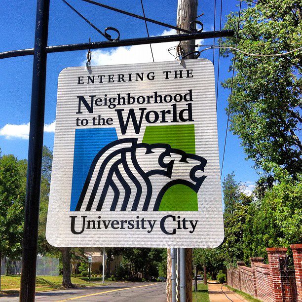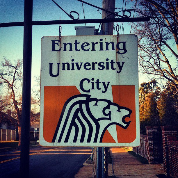

This past week I noticed University City workers replacing a weathered "Entering (Leaving on the others side) University City" sign with a shiny new blue and green "Entering the Neighborhood to the World, University City" sign. Other than being new, the sign was awful. "Neighborhood to the World" is just an odd phrase. While the claim shows that small municipality boosterism isn't dead (and that's fun), I don't think a city slogan should force one to contemplate what it means (apparently it's meant to celebrate diversity).
For the past week as I walked past the "Leaving…" sign I asked myself, if I am leaving the neighborhood to the world, am I in fact passing into the world as I pass this sign? Then there are real problems with the design of the sign itself. It's legible enough for someone walking down the street, but someone driving past won't get to the bottom of the sign, where you know, the actual name of the city sits, somewhat smaller than the slogan. I really disliked it, even joking on Facebook that I'd found my signature issue (and campaign song) to catapult me into U-City political office: Signs, signs, everywhere bad signs…
Now it appears that the U-City city council heard my threat! I'm joking of course, but it turns out that others weren't too happy with the logo, or the process. According to University City Patch, the city council has voted 4-3 to unbrand the rebranding. This means all the signs, stationery and other supplies displaying the logo will be removed. According to the Patch story, the rebranding effort cost $39,000 with an additional $10,000 already spend on new signs and banners.
How and why did the process get this far only be rejected? From Patch, "(Council member Paulette Carr) looked into previous efforts to give the city a brand identity and a logo. The last change occurred in 1975-76 and Carr said her research indicated that the council voted to approve a recommended option after ideas went through the Municipal Commission on Arts and Letters, a public viewing and then brought back to the council." There were also objections that the new colors no longer matched those of the school district, as the older logo had.
At the time the re-branding was revealed, several months ago, Mayor Shelley Welsch told University City Patch, "Our new community identity, ‘Neighborhood to the World’ captures the true brand essence of University City." Through focus groups and interviews, a branding consulting firm identified the following community attributes: the city’s central location, arts and culture, parks and recreation and the friendliness of the residents. At least they didn't go with the now passed "Half Way to Everywhere" (which, incidentially, is no where) once used in The Grove.
Not satisfied with the logo and slogan status quo? Surely for a fraction of the $39,000, the guys at STL Style would have licensed their design:


