Overview
This report looks at the correlation between total crime (violent crime and property crime) and recent home prices in the 50 largest metro areas in the United States. The study uses metropolitan statistical area (MSA) level data and zip code level data to minimize inconsistency with respect to inclusion or exclusion of suburbs of the ranked towns – a major flaw of city limit (“city”) rankings. This study looks at data from full metro areas, metro suburbs, and metro urban areas. For this study, the urban zone is the defined as the inner 20% of the metro area by population. Suburbs are defined as the outer 80% of the metro area by population.
Urban experts warn that it is a common blunder in social science to assume that correlations imply cause-and-effect. Any correlations could come from a common source, rather than cause-and-effect. Still, we recognize that real estate sites feature crime as a major statistic they say people should consider when deciding where to live. And popular choices on where people choose to live bid up home values.
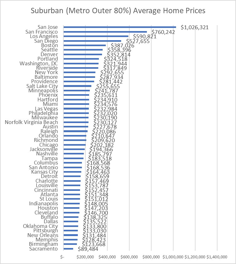
The crime and home price data for this study comes from three sources: 2015 FBI Uniform Crime Reporting Table 6 for full metro crime data, the website Moving.com for zip code level crime index data, and Zillow.com for zip code level average home prices and metro area average home prices. (Note: Moving.com just recently suspended inclusion of crime data on their web site for unknown reasons.) US Census Bureau data is used to identify MSA zip code area latitudes and longitudes. For this study, urban data is computed from the zip code zones closest to the metro area core-city City Hall and whose combined populations make up the inner 20% of the metro population. Suburban data is computed from remaining zip codes to the edge of the metro area as defined by the Census Bureau and OMB MSA definitions.
The urban crime index was computed using the Moving.com formula by combining zip code crime indexes, weighted by population, from the inner 20% of each metro area. Suburb crime index was computed from FBI Table 6 full MSA data, and the urban crime index from above using the formula: Suburban Crime Index = (MSA Crime Index – 0.2 * Urban Crime Index) / 0.8. This indirect approach provides the suburb crime index that, when combined proportionally with the urban index, yields the FBI Table 6 full metro index. (For any blank entries in 2015 FBI Table 6, data from the most recent years was inserted.)
Full MSA Rankings and Scatter Plot
First consider full metro area data. The three charts below show crime and property value data for full metro areas. The Total Crime indexes are computed using the Moving.com formulation from FBI Table 6 data. The formula adds the crime counts of the seven FBI crime categories and normalizes to the US crime average pegged at 100. The FBI published a crime index with this formulation until 2004. A crime index of 200 means the area has double the US average total crime. 50 means half the US average. The points on the scatter plot are connected with lines (left to right) just as a visual aid.

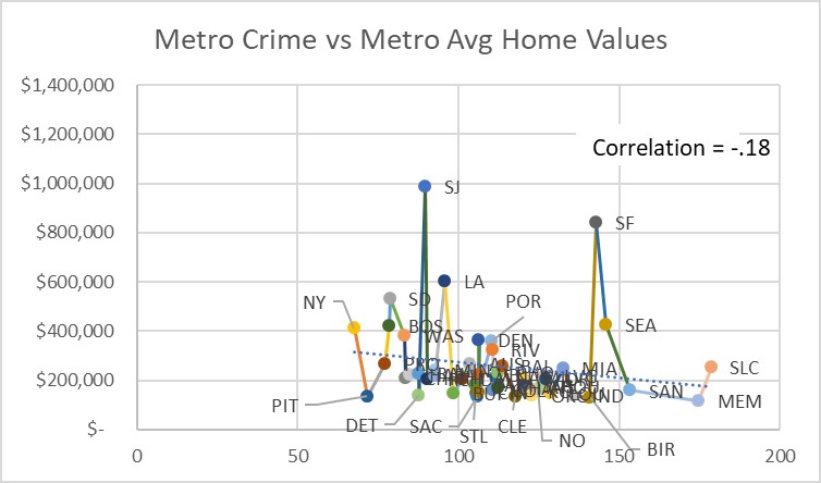
Full Metro Data Observation
At the full metro level, there is little association between home values and crime looking at the trendline and correlation between home values and crime. Decisions on where to live, metro to metro, are apparently not driven by overall metro crime levels.
This could be because the public does not believe crime is a major factor they should consider when seeking to move to a new metro area. Or it could be that the public is not aware of metro area crime data, compared to widely publicized “city limit” crime rankings. The public may be equating city crime rankings with metro rankings in their minds without realizing that there are significant ranking differences between the two.
Urban and Suburbs Rankings & Scatter Plots
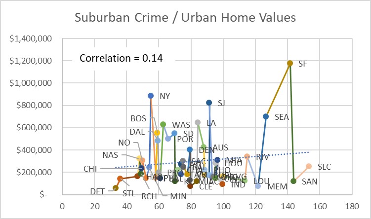
The following plots compute crime and home price numbers separately for metro inner urban cores (inner 20% by population), and suburbs (outer 80% by population).


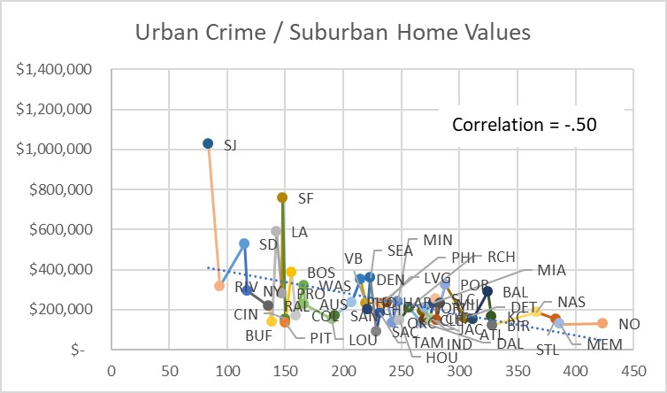

Urban/Suburban Data Observation
Here are three observations from the crime and home value data from data split into urban/suburban components for each of the 50 largest metros in the United States.
- While there is little correlation between crime in the suburbs and property values in either the suburbs or the urban areas, the same is not true for urban crime. As we might expect, metros with high crime in urban areas has some correlation with low home values in urban areas. But what is most pronounced in the data is the correlation between urban crime and suburban home values. Metros with high urban crime indexes correlate even more with low suburban property values, in the top 50 metros, than high urban crime rates correlate with low urban property values. While not claiming one causes the other, one could reasonably project that a metro with high urban crime will likely have diminished suburban home values, in spite of the safety of the suburbs in that metro.
- Another interesting observation is that many metros with poor crime rankings on the urban crime list, such as Detroit and St. Louis, rank well on the suburban crime rankings. This should not be too surprising since suburban crime would have to be very low in those cities to get their full metro crime averages down to the middle of the pack positions they hold in the full metro crime rankings created from FBI Table 6.One explanation for the big difference for urban vs suburban rankings for metros Detroit and St. Louis may be geography. Both cities were founded against major mobility barriers – Canada/Detroit River for Detroit, and the Mississippi River/Illinois for St. Louis. Their core city halls are almost on peninsulas causing extreme metro sprawl away from downtown. Downtown core for both metros is far from the current metro population centers, and their downtowns are no longer major crossroads for traffic spanning the metro area, leading to urban core decline. Their downtowns form part of the outer edge of the city boundary elbow, rather than the inner edge of the elbow, such as Chicago or Boston.
- “City” crime rankings (using core city limits only) often line up with the urban ranking shown here for many older Eastern cities, since those cites usually encompass only a fraction of their metro areas with the oldest housing in the metro core. When boundaries are defined consistently using Census and OMB defined MSA rules based on population, instead of politically determined city limits, more Western towns fare poorly in crime rankings.
